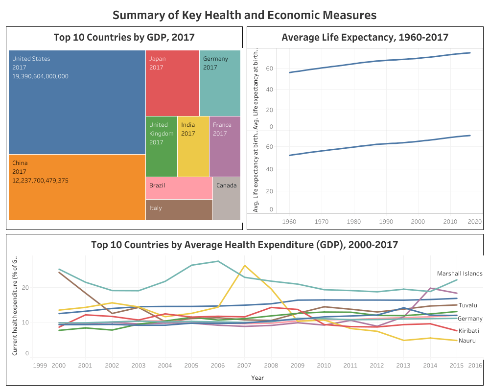
This is a dashboard that I’ve put together as a basic visualization exercise. The aim of the visualization was to provide simple visualisations of key health and economic trends. The indicators that I chose to focus on were GDP in 2017, Average Life Expectancy for men and women between the years 1960 and 2017, and the top 10 countries on average for Healthcare expenditure since the year 2000. The data was obtained from the ‘World Indicators’ dataset, which was used in Week Ten of the #MakeoverMonday Tableau challenge from 2019: https://www.makeovermonday.co.usck/data/data-sets-2019/
As a first attempt at creating a dashboard, the attempt was mixed. The charts in general could probably display information more clearly. Though the dashboard on Tableau Public is somewhat clearer than the image below, nonetheless, there are issues with the ease of use to work on in the future. The full dashboard, including individual sheets, can be found here: https://public.tableau.com/profile/scott.davies#!/vizhome/SummaryofKeyHealthandEconomicMeasures/Dashboard1?publish=yes
There are some interesting insights that can be obtained from this dashboard. Firstly, the trend of life expectancy increasing for both men and women over the last several decades is clear. For both men and women, life expectancy has increased by several years, from a starting point of below 60 years on average worldwide to around 70 years old as of 2017. A further data visualization and analysis could break these statistics down further, by region or compared to national GDP.
The top 10 countries by average health expenditure showed a surprising result. These countries were primarily made up of small island nations such as Nauru, Kiribati and the Marshall Islands. However, nations with a very high overall GDP such as Germany were also present in the top 10. The factors behind this are worth further consideration and would make an ideal topic for a further analytical project. While the dataset being utilized has a sufficient number of measures and dimensions for analysis, the data was not without issues. There were notable gaps in the data, with some measures and some years having considerable gaps in the data. This limited the range of analysis that could be conducted. In addition, while the measures were mostly self-explanatory, there was no data dictionary to go with the dataset, which made analysis somewhat more difficult. Overall, working with this dataset was a worthwhile exercise as a new practitioner of Tableau. My visualization skills were sharpened, as were my analytical skills of looking at a dataset and exploring it for insights to present.
